Your choice of words on a website will be essential to how your business will come across. However, this blog isn’t about your choice of words, it’s about the font those words are in. The font choice should be something you think about before you even start designing the website. The fonts that you choose can have effects on readability, perception and even tone. Below, we will take you through things to consider.

How many different fonts should we use?
Green Stripe Media will usually choose two fonts. One for headings and one for the body of the site. If you have too many fonts a site can look ‘busy’, and it makes the user experience poor, making customers frustrated or irritated at your site.
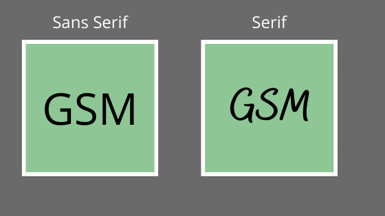
There are two categories when it comes to font. ‘Serif’ and ‘Sans Serif’. We like to choose one of each for Headings and Body Font. Serif can be described fancier, or a small ‘flick’ or line added onto the end of a letter, whereas Sans Serif is just a simple letter. We have a couple of examples below.

We like to use Serif, as it can be a bold and strong font, that you would expect from a heading and a Sans Serif font for the body as it is friendly and easy to read with little effort. This improves the user’s mood and readability. As we said earlier, we like to choose one from each category, making the site look understandable and clear.
Colour Choices and Formatting
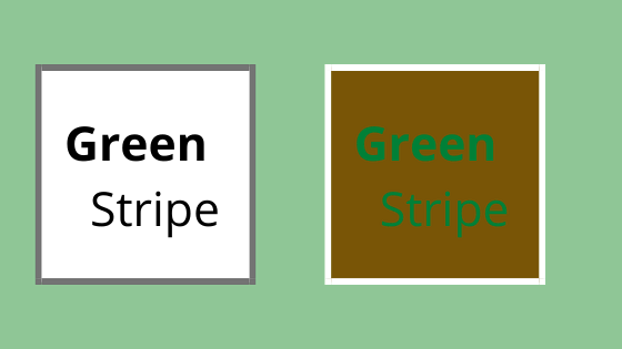
Your font colour also makes a difference to your website. Some colours aren’t readable on other specific colours like a green font on a brown background.
Additional formatting can highlight and draw the reader in; using bold or heavier font weights is an excellent way to break up sections or emphasise a phrase or link.

Getting Your Point Across
Your site, as well as your branding and colours, will be portrayed in your choices of fonts to your website user. The user should be able to look at your site and in the first few seconds, be able to get an idea of what the website is trying to get across to them.
For example, if the website is trying to sell a professional service such as financial or legal companies, where it should stick to an easy to read but smart font. Or is it an artist or media business that should try and choose fonts that stand out and look good, but ensuring the user can still read the content.
As long as the fonts are chosen with care, readable and take users in the right direction to look into your services or products, then you have made the best possible choices on your website.
We will often spend hours changing and previewing a site with different fonts – it’s amazing the difference it can make.
We can help!
It’s time to make the most of the digital market and investing in a high-quality website that showcases what you have to offer to potential customers. At Green Stripe Media, we are specialists in developing websites for companies that want to develop their digital offering, sell their products and services to customers and take their business to the next level.
Offering affordable solutions for businesses of any size and flexible payment options without the large development fees, get in touch with us today to discuss how we can design and build a website that perfectly reflects you and your business.
Please visit ‘Our Work‘ to see our previous websites and what we can do for you!
